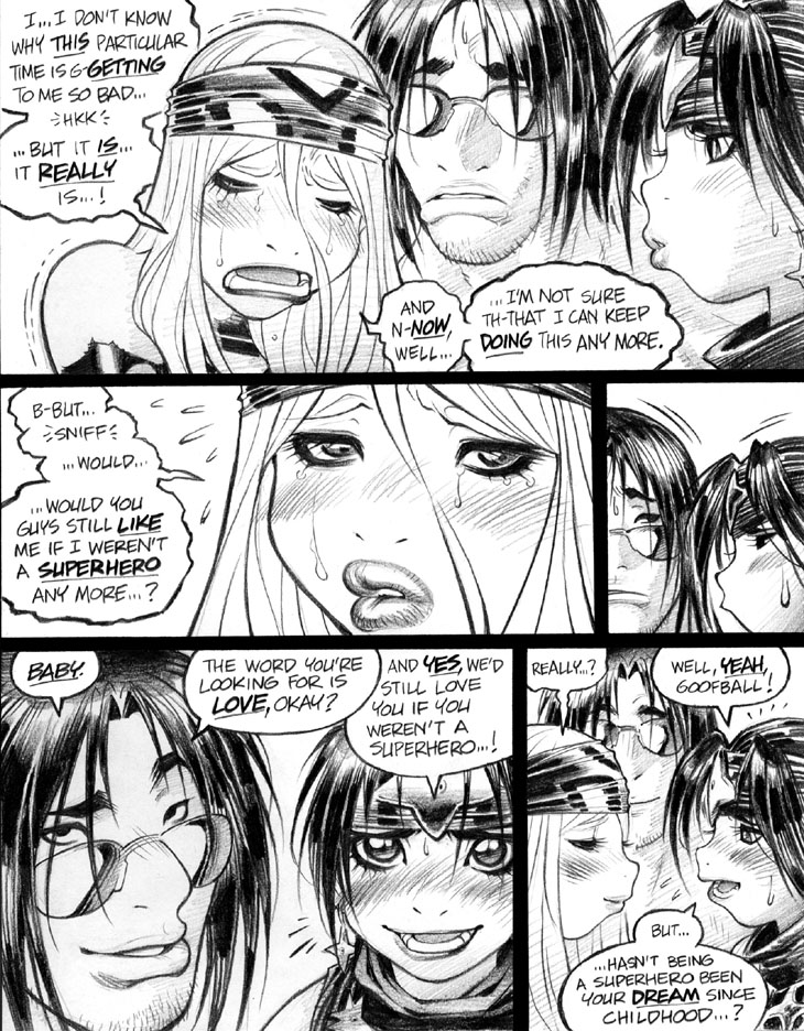
I chose to draw nothing but close-up shots on this page, which is something I never would have tried on a so-called “real comic”—that is, on one of the more conventional books I wrote and drew in my career before Empowered. On a normally formatted comic, all kinds of storytelling alarms would’ve been blaring and klaxoning in my head with such an “all-close-up” layout, as narrative custom holds that one should use a wider variety of shot choices on the average comic page, if one can conceive of such an animal as the “average comic page.” Along those lines, acclaimed writer/ artist Eddie Campbell has famously—okay, semi-famously, as we’re talking about indie comics—declared that every comic page should include a full-figure, head-to-toe shot of at least one character. That’s not a narrative stricture that I personally endorse—for one thing, Empowered’s squat, vertically challenged format doesn’t lend itself well to full-figure images—but it does suggest the generally laudable approach to shot variety I just mentioned.
What that Campbelliam dictum implies is that the ideal comics page should feature panels with a broad range of “camera distances,” as a full-figure shot must by necessity appear within the context of a medium- or long-shot with, presumably, environmental detail visible around it. (Er, unless one employs the manga trope of the full-figure image that overlaps other panels without such an environment around it, which is another story entirely.) The problem with a close-up-intensive page like this one is that the reader can theoretically lose track of where the characters are located in relation to each other—or, in the context of a background-free page like this, lose track of where the characters are located, period. Admittedly, that’s not a problem for this particular page, as all three characters are seated only a foot or two apart, but would be a bigger issue with a less closely proximate cast of characters.
Still, I have to say that a more “responsible” take on this page, using a broader range of shot choices and, y’know, actual background drawings might not have been that great of an improvement. A scrupulously detailed series of “interior shots” laboriously depicting Emp’s living room as a backdrop would, I think, not necessarily have delivered the emotional impact I was looking for during this dialogue exchange. Emotionally charged facial expressions were always going to be far more critical to what I wanted to convey with this sequence than the backgrounds surrounding them.
Anyhoo, I’ll blither on at greater length about drawing background detail in some later commentary. In the meantime, that’s enough for today, I think. Later, folks!
-Adam Warren

