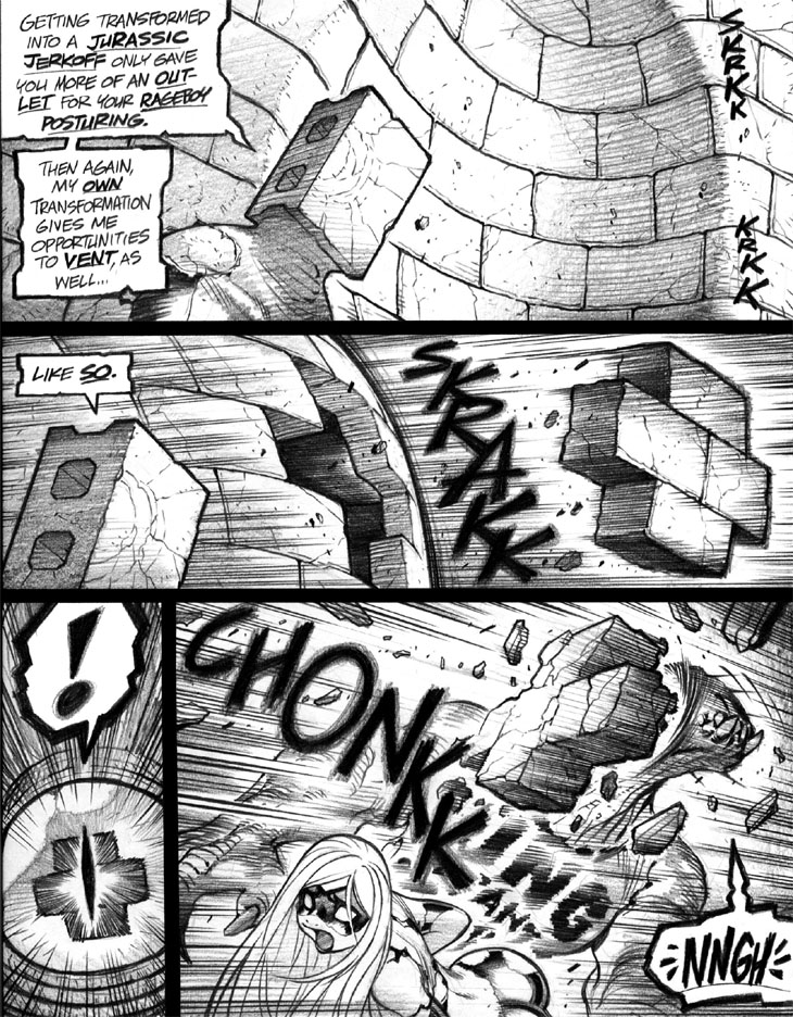
One thing that surprises me anew about these early installments of the series how impressively wonky and dashed-off the lettering is, let how surprisingly readable it remains. Nowadays, I’m far more sensitive about lettering quality, and almost every Empowered original page I currently produce includes a page of painstaking “lettering patches” to be copy-pasted over any glitches or less-than-ideally inscribed words. Then again, today I’m far more sensitive about every little aspect of the books, as they slowly grew and evolved and (ahem) matured into “a real comic” in my eyes. Alas, even though I feel that the present series’ art and lettering and storytelling and characterization are far tighter and richer and more detailed and accomplished, each newer volume sells fewer copies than the slapdash early installments; I’d really prefer to think that no causal link exists between higher quality and lower sales, though.
In a whimsical twist, the reason why I use bolded and underlined emphasis lettering instead of the more common bold and italics used in most comics is that I can’t reliably pull off italics in my hand lettering; but, as you’ll notice on closer inspection, almost all of the text on this page looks oddly slanted to begin with. I’m reasonably sure this page’s pseudo-italicized lettering dates back to the era when I was really cranking out proto-Empowered pages with carefree and frankly sloppy abandon, and was hastily scrawling down “first-draft, only-draft” dialogue before racing onto the next panel.
Panels 1-2: I do vaguely recall considering the whimsical use of “rubbery” sound FX like “BOINGG” for this sequence, but thought that didn’t quite convey the effect I was looking for. Note, by the way, my preference for double consonants at the end of sound FX with short vowel sounds, such as SKRAKK and CHONKK—and, elsewhere in this chapter, WHRAMM and KLUDD and VWIPP and VORPP. For reasons I can’t quite articulate, terminal double consonants in sound FX add “a little something special” to my ear—or eye, I suppose, given that we’re reading the dang things and not listening to them.
Panel 4: I’m not entirely thrilled by the placement of the sound FX “CHONKK” in this panel, as its position to the left of King Tyrant Lizard means that—technically, at least—it precedes the cinderblocks’ impact. Ideally, placing CHONKK directly above, below or to the right of the action would’ve read marginally better, in effect making the sound FX more simultaneous with the impact—but the layout of the panel left few options in that department. Not a serious issue, really, but I still find the placement a teeny bit annoying.
-Adam Warren

