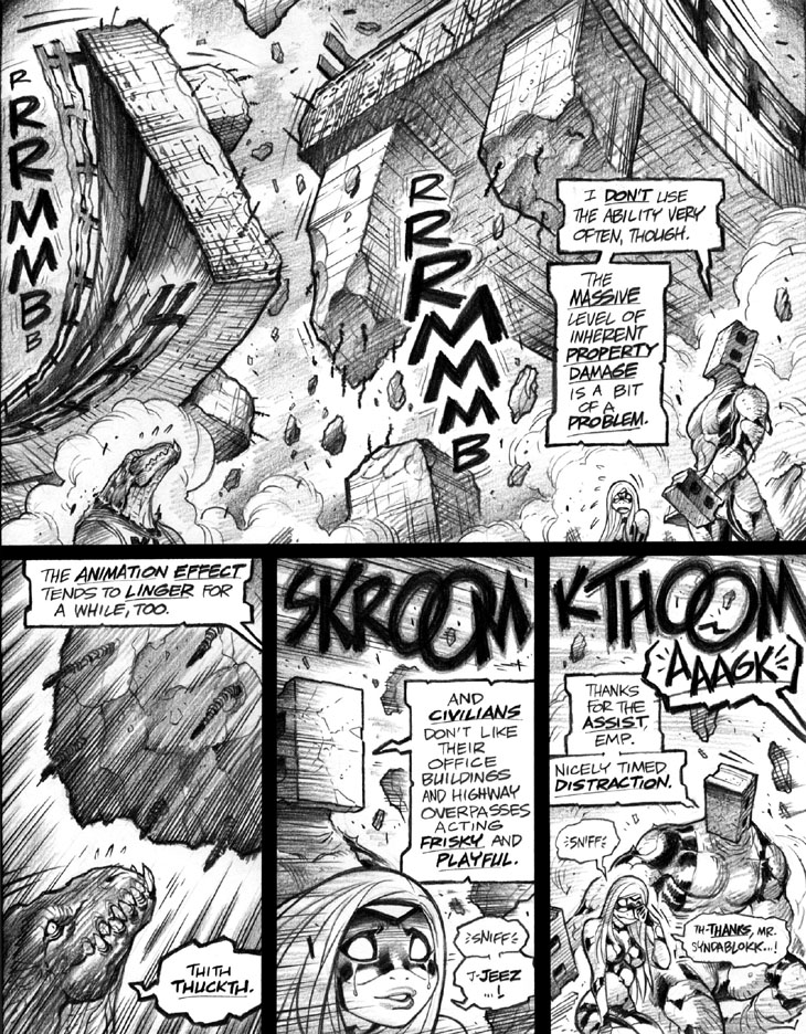
Panel 1: Those alleged “highway overpasses,” alas, seem way too narrow to my present-day eyes. They might have been believable as single-lane cloverline exits or the like, but don’t cut it as theoretical twin-lane stretches of roadway.
Panel 3: Gotta say, “SKROOM” is an oddity, as it’s a sound FX I rarely—possibly never, other than here—use in Empowered. By contrast, “KTHOOM” in panel 4 is a sound FX very commonly used—and reused, many times—throughout the series. As I’ve mentioned before, a surprisingly limited range of sound FX “read right” to me, a weirdly narrow selection that I’ve pieced together over the years, hence the noticeable repetition inherent to my FX choices throughout the series. I really would love to use the wider and more flexible assortment that many comics writers use, but I’m stuck with the few sound FX that can pass through the filter of the inscrutable algorithm in my head that determines acceptability; everything else strikes me as goofy or clumsy or inept.
Then again, a fair number of modern comics writers don’t use sound FX, period. While I generally assume this practice to be a tonal choice, it might also be a canny defensive measure on their part, given how godawful computer-lettered sound FX can work out nowadays. As badly as some less-skilled letterers can botch dialogue and word balloons, the startling degree to which they can crater your average BLAMM or WHKOOM is far more dramatic. One oft-repeated error: Some letterers seem almost surreally unaware that, with smaller sound FX, you need to thicken the letters’ outlines to compensate for the decreased size, leading to the common fallacy of small sound FX with absurdly delicate, hard-to-read, excessively thin outlines. (Note that this blunder is a direct artifact of the computer-lettering process, as few old-style hand letterers would—or, indeed, could—ever have made this specific mistake.) A well-done sound FX can add genuine impact and energy to a comics page—see many fine action-oriented manga, from Negima! and Air Gear to Blade of the Immortal and One-Punch Man—but a badly done example can be a panel-mangling trainwreck. I’ve seen some comic pages—including ones I’ve written myself—so bungled by crappy FX that I’ve thought, “Dang, might as well have left the stupid things off entirely.”
Along those lines, sound FX are just another space-hogging panel element for which ignorant artists probably won’t leave enough open room in the panel. (Tough enough to get the typical comics artist to remember a panel might have word balloons, and plan accordingly.) I suspect that the format of the “open” sound FX—usually a narrow red outline, with the artwork still visible inside it—developed in the 90s because of inept artists who weren’t leaving enough space for a more conventional, “opaque” lettering. Even with more skilled collaborators, sound FX can still be a graphic-design problem; I eschewed sound FX in Marvel’s Iron Man: Hypervelocity and Galacta: Daughter of Galactus because both stories used narrative captions as well as word balloons, and I worried that adding KLANGGs and BKOOMs to the mix would’ve made the books’ panels too “busy” and graphically crowded.
Damn; three paragraphs on comics sound FX, and I’ve barely scratched the surface! (Guess I’d best save further discussion of the topic for another commentary.)
-Adam Warren

