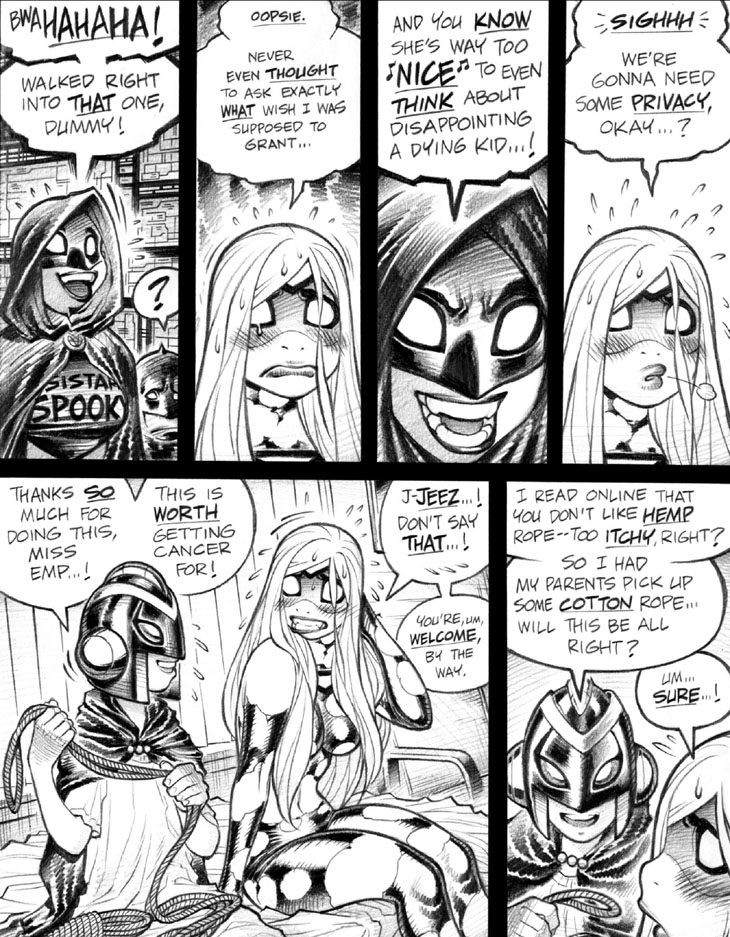
Panel 1: Time for some comics lettering technical trivia! Note the open-ended tail on Spooky’s word balloon, which is an approach I prefer to take with (bold- and jagged-outlined) “burst balloons” placed close to a character’s head. I doubt this technique would work as well in a full-color comic, as that would present some problems for the colorist, who would have to ponder exactly how to handle the resulting open space. Should they extend white from the open tail? Or add a white outline around the character the tail is seemingly contacting? Hrmm.
Panel 3: A particularly malevolent-looking shot of triumphant Spooky, here—the slightly unusual shape of her mask’s eyes adds to the effect. I’ll have to remember this image for future use, either for her or Emp.
Panel 5: Time for another bit of comics lettering talk! Akin to panel 1’s bit with the open balloon tail, I vastly prefer to place word balloons adjacent to—and, arguably, “behind”—the characters speaking them, rather than having the balloons overlap into—or, arguably, “over”—the characters’ heads. The look of a word balloon’s outlines “biting into” a speaker’s artwork drives me crazy, gotta say. Not everyone feels that way, though, as at least one of my former editors felt that abutting word balloons up against a character—as with Manny, here—makes the balloons seem like they’re actual visual, physical elements in the scene, rather than a separate storytelling “layer.” (Needless to say, I disagree.)
-Adam Warren

