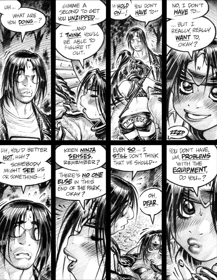
As I said earlier in the volume, I’m not a big fan of the inflexibility and—all too often— monotony of grid-based page layouts, but dang if they aren’t a great way to rattle off a whole lotta story beats and dialogue in a single space. Wouldn’t wanna structure an entire story based on a grid*, but they’re still handy to deploy on occasion.
Panel 3: In another two volumes or so, I’ll finally get around to using a different font on the “NINJETTE” lettered across the seat of her shorts. The existing blocky, all-caps type kinda blows, I gotta admit. Then again, like all of early Empowered, I was just wingin’ it when I created Ninjette and her outfit, and didn’t bother with any preliminary character designs before slapping her down on paper. If I had, I might’ve thought better of the font I wound up using.
-Adam Warren
*Yet another reason why I think Alan Moore’s Swamp Thing is vastly superior to Watchmen,
as the former’s wild, unorthodox, freewheeling page layouts by
Bissette, Totleben, et al appeal to me far more than the rigid,
metronomic grids that Gibbons used on the latter.

