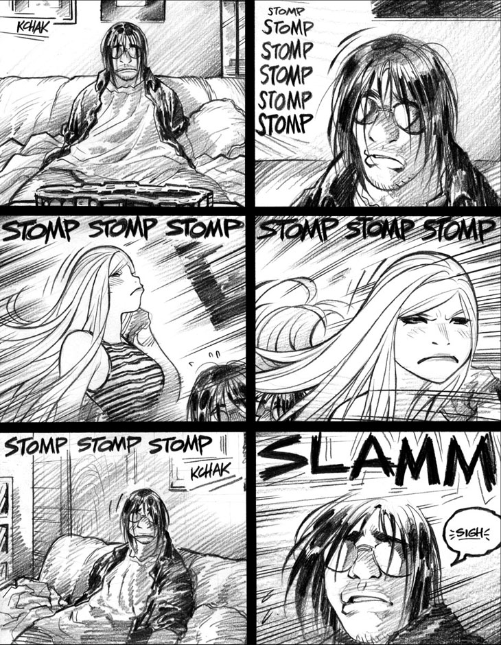
Gotta say, not much else springs to mind about this fairly nondescript page. So, in place of a standard commentary, I’ve worked up yet another Twitter comics rant about storytelling practices that bug me. In truth, I can’t really countenance the loss of potential work time that such satisfying but time-consuming rants represent—but, if I can “double-dip” by (re)using ’em for Empowered webcomic commentaries, then spending time on ’em is halfway defensible.
And so, without further ado, time for a comics art/ storytelling rant, crossposted from my Twitter account!
Recently read a few new-ish North American comics. Notable among ’em: two series that, though drawn by skilled artists, were not very good.
I’d like to break down in more detail exactly why these series didn’t work for me. (As usual, I won’t be identifying the books involved.)
I’ll largely ignore the writing, as the books’ stories and dialogue were never likely to appeal to me. (Not a big fan of the writers’ work.)
Purely on the level of visual storytelling, why didn’t these comics drawn by talented artists succeed—In My Humble Opinion, of course?
I find flawed but interesting comics are better fodder for analysis than utter trainwrecks. Why doesn’t this semi-good comic work better?
Comic #1’s visual narrative was tanked by an almost pathological avoidance of close-ups on the lead characters—or ANY characters, period.
An unrelieved diet of medium and long shots almost literally distances the reader—well, THIS reader, at least—from a comic’s characters.
The artist was so dogged in his shunning of close-ups that the book’s artwork looked like security-camera footage. (Well, not exactly, but…)
Obviously, if you’re intending your comic to convey a remote, clinical, detached perspective, avoiding close-ups is a useful technique.
Art rant paused, for a brief but mildly peevish sub-rant regarding my previous art rants:
For the record, every comics-art suggestion I tweet is at best a rule of thumb, not some inviolable Pronouncement of Comics Law on my part.
I, too, can envision exceptions—from reasonable to far-fetched ones—for every single comics ProTip I’ve ever posted here.
Alas, the 140-character limit precludes adding “for the most part” and “generally speaking” and “mostly” onto each of my comics suggestions.
If I tweet, “Avoid drawing characters with two left hands,” some art-rules lawyer will instantly invoke a scenario where that’s desirable.
Sub-rant closed. Now, back to our previous art rant, already in progress:
So, yeah, reading Comic #1 once again crystallized my views: Without good “facial work,” your comics storytelling ain’t worth much to me.
As a reader, I’m just not engaged by the work of a otherwise skilled artist who eschews expressive and emotive close-up shots. COMICS FAIL
Eddie Campbell famously—well, famously-ish—said that every comics page should feature a full-figure shot. I say, better add a close-up, too.
I should clarify that a surprising number of the North American comics I’ve read this month were plagued by pathological close-up avoidance.
Domestic and foreign comic artists alike bungled this rudimentary storytelling concept. Why the international close-up-shot neglect? Dunno.
I should further clarify that very few manga I’ve ever read make this peculiarly Western error. Mangaka do love their close-up shots, folks.
(As if we needed yet another g-d category in which even not-so-great manga are blowing away a sizable chunk of the American comics field.)
Note that close-ups needn’t take up much space on the comics page to work well. Amanda Conner used fairly small panels on Power Girl, I think.
Extreme version: The wee, square insert-panel close-ups Paul Azaceta peppers his Outcast pages with. Very small, but still effective.
Comic #1’s writer might be partially at fault for the book’s paucity of close-ups, though, as this is an oddly common problem in his books.
Most of the writer’s books seem to lean heavily on medium and long shots, hinting that his scripts rarely provide for stand-alone close-ups.
Tough for the artist to opt for a close-up when the writer insists on a “two-shot” of both characters to enable back-and-forth dialogue.
Most of the “two-shot” panels the writer demanded would’ve worked better when broken down from a single big panel into two smaller ones.
ORIGINAL VERSION: Panel 1: DUDE speaks, BRO answers, DUDE replies, in yet another “ping-pong” exchange of dueling word balloons. (Yawn.)
ALTERNATE VERSION: Panel 1: DUDE speaks, BRO answers. Panel 2: DUDE replies, in close-up, likely with a new facial expression. (Much better!)
The added storytelling value of being able to alter DUDE’s expression during his reply: a clear improvement on the static original version.
Alas, Comic #1’s artist so avoids close-ups that I can’t say for sure if he’s even capable of drawing emotive, engaging facial expressions.
Comic #2’s artist can, in fact, draw very nice facial expressions, judging from the sparse handful of close-ups his book deigns to offer.
Comic #2 also relies heavily on medium and long shots, the better to enable the word-balloon chains of dialogue exchange the writer prefers.
The writer gives the artist space for detail-intensive panoramas and double-page spreads, but stingily denies the reader engaging close-ups.
So, close-up-deficient Comic #2’s art distances me as a reader, with only the writer’s so-so dialogue left to delineate characterization.
Hellaciously strong dialogue would be required to counteract the art’s sterile, distancing remoteness. Such dialogue, alas, ain’t on tap.
(Side note: The bad guy’s wince-inducing snark in Comic #2 makes me glad that Empowered’s next Big Bad is entirely incapable of snark.)
End of rant!
-Adam Warren

