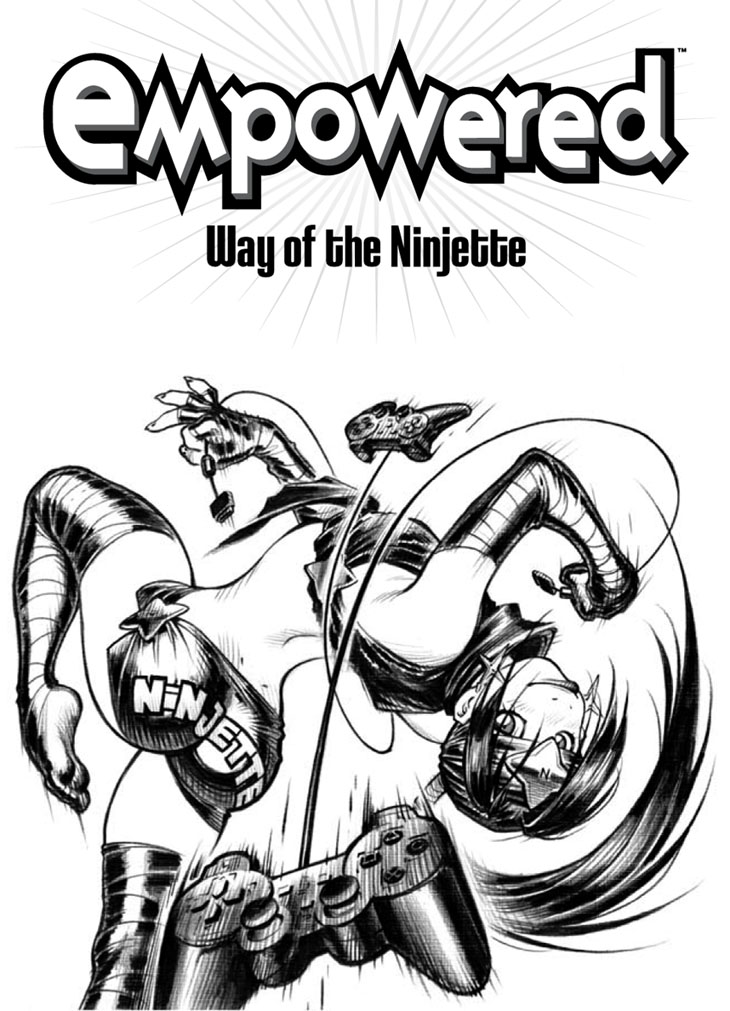
I very much like the idea of this wild-looking pose, but the wonky and distorted look of Ninjette’s upper torso doesn’t work for me. Alas, this challenging image was a bit far beyond the limits of my figure-drawing ability; some photoreference would’ve been really handy, but I had none available, as I pulled the pose straight outta my head. Oh, well.
I have dim memories of receiving some criticism over the notably extreme clinginess of Ninjette’s shorts, given that they appear more akin to the magical, body-paint-like material of Emp’s supersuit than any conventional fabric. To get very (creepily!) specific, if I were aiming for a more photorealistic artistic approach—which, admittedly, I am not—the “stretch zone” of the shorts’ fabric should extend further downward than it does, rather than appearing quite so, ah, “vacuum molded” to the upper curves of Ninjette’s glutes. Ah, but as you will see a mere 50-odd pages from now when Emp cosplays as the microskirted “Sexy Librarian,” I am fully capable of depicting tight clothing more—ahem—“realistically” stretched across a character’s behind. (Or “toothsome rump,” as the Caged Demonwolf later puts it.) The question is, so what? If a reader is offended and upset by the image of Ninjette rocking tight shorts, why would an incrementally more realistic approach to fabric rendering possibly make that shot any less offensive?
I am reminded of a male artist I know who positively adores patting himself on the back for his—ahem—“realistic” approach to drawing his female characters’ tops. That is, unlike the somewhat lazier approach that many male artists take, this dude lovingly and painstakingly renders the fabric stretchmarks that would, in reality, extend across the chests of rather busty young women wearing tight T-shirts or the like. (That is, akin to the stretch-marked, fabric-based top that Sistah Spooky wears in Empowered, and not the unearthly, body-molding alien membrane of Emp’s suit.) One suspects, however, that a male artist truly as sensitive and enlightened and “there for you, ladies” as he clearly considers himself might consider, y’know, not having all of his invariably conventionally attractive young female characters wear very tight tops in the first place. Way to ally, there, little buddy! Perhaps it is merely a sign of my own inadequacy that I fail to see how a slightly more true-to-life visual approach to depicting clingy clothing on female characters could be considered any more sociopolitically acceptable—or less offensively objectifying—than a more “unrealistic” technique.
In truth, I’m not 100% clear as exactly why I didn’t pursue the aforementioned “incrementally more realistic approach to fabric rendering” when drawing Ninjette’s shorts in the first place, as I don’t perceive it as any more or less “cute” than the vacuum-molded approach I wound up using. (Note that I employ the word “cute” in the wan and deluded hopes that this seems a less creepy term for a fellow Of A Certain Age like myself to use in reference to ladies decades younger than I, as opposed to “sexy” or “hawt.”) See, her “hip-huggers” are derived directly from an unpublished Dirty Pair story I drew in which Kei and Yuri were wearing their original costume of “chrome, low-rider shorts” designed by DP illustrator Yoshikazu Yasuhiko—and, upon consulting those old pages, I was nonplussed to notice that I depicted the DP’s short shorts with the stretchier, less clingy and more—ahem—“realistic”—but still very tight, never fear!—approach I just detailed. Mysterious!
My theory, in retrospect? I was probably sweating how a more—ahem—“realistic” fabric technique would have made drawing the lettering across the shorts’ backside a bit difficult, especially with regards to the “NJ” in the middle of “NINJETTE”. This is slightly puzzling to me now, as all I would’ve had to do was dig up more photoreference online to figure out the behavior of “butt lettering” on tight shorts, a task which would not necessarily have posed a crippling burden to me. I can, however, tell you that I never bothered to change the look of Ninjette’s shorts because, hey, I’d already established that this was how they looked. Didn’t see the point of changing to a stretchier and less clingy approach hundreds of pages after the fact. (I did eventually end up changing the font of the NINJETTE lettering, though, as that blocky type kinda sucked.)
-Adam Warren

