Volume 3 Page 22
Posted April 20, 2017 at 12:01 am
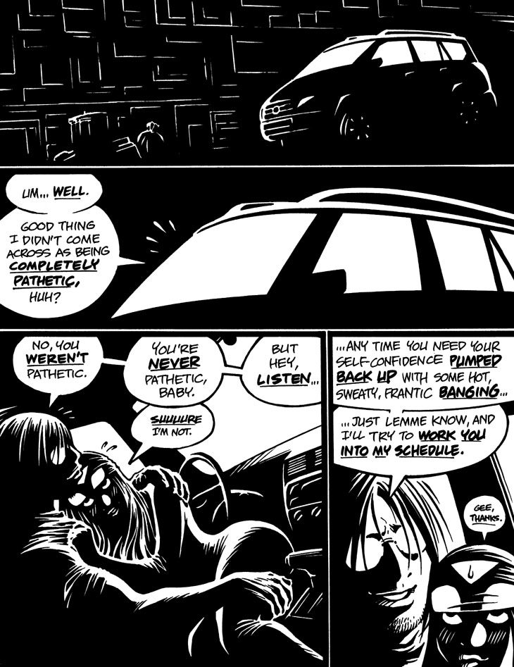
Panels 3 and 4: I like the idea of Emp's blushes appearing as mildly surreal white marks in this hyperstylized high-contrast rendering scheme. Hey, Miller never tried that in Sin City, as far as I can recall.
BTW, if the lettering looks a trifle odd in this story, that's because the Sharpies® I used to letter it aren't quite ideal for the task. The Extra-Fine Sharpie® works decently enough for the regular text, but the larger Fine Sharpie® is a bit too coarse for the bolded emphasis lettering. Oh, well.
-Adam Warren
Comments

