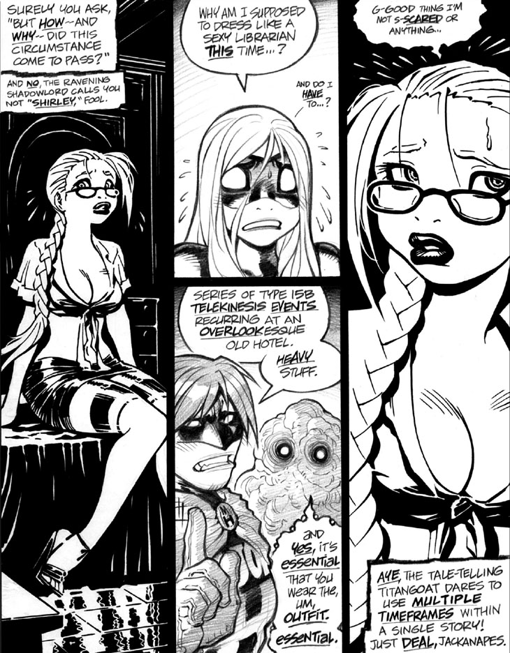
Yeahp, I chose to go with Sharpie-based art for the sequence throughout this story with Emp dressed as Sexy Librarian Bait in the “Overlookesque hotel”—a reference, of course, to The Shining’s setting, just in case you’re too young to have seen the movie or read the Stephen King novel. (Or seen the theoretically more faithful 1997 TV miniseries, I suppose.) I believe I took this art approach at the time to save my oft-ailing drawing hand some penciling stress, and also because I’ve long been a semi-closeted fan of high-contrast, “harsh B&W,” black-intensive artwork. This interest, as I’ve mentioned before, long predates Frank Miller’s Sin City, and was likely kicked off by Jim Steranko’s chiaroscuro-tastic graphic novel Chandler: Red Tide, which I strongly suspect inspired Miller as well. Hence me gritting my teeth when, without fail, someone inevitably comments, “Hey, looks like Sin City!” every g-d time I post a piece of “harsh B&W” artwork.
Panels 2 and 3: Not a big fan of this “read down to panel 3, then back up and over to panel 4” layout structure, but I suppose it reads well enough here. Best to avoid ambiguity, though, in where the reader’s eye should go next, especially since some comics creators “muddy the structural waters” and elect to use a different reading order on this type of layout.
-Adam Warren

