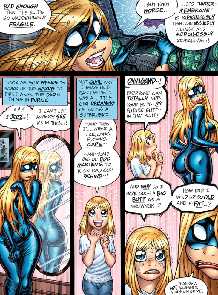
Panel 1: I’m intensely displeased by the inexplicably serifed “I” on “ITS” in Emp’s third balloon. I’ve no idea whatsoever as to why the hell I did this, as in comics lettering one should only use the serifed I for the first-person pronoun, as in the usages in panel 3. (Note that this is one the many sins of the notorious Comic Sans font, which uses the serifed "I" as a default.)
Panel 2: Not a bad shot of Emp and her reflection—with the fully intact supersuit, for once. Note the inclusion of the blatantly stylized lines on the mirror, which are intended as a truly overt way to clarify for the reader, THIS IS A MIRROR, SEE, AND NOT SOME KIND OF ALTERNATE REALITY PORTAL OR WHATEVER. This is an old-school riff I probably picked up from the 70s-era comics of my childhood, as well as Rumiko Takahashi’s work, where those “streaks” often appeared on mirrors and windows.
Panel 4: Not a good shot of grown-up Emp, here. Oh, well; can’t win ’em all, folks.
Panel 5: While this is an amusing riff (presumably ripped off from manga), I went way the hell overboard with Young Emp’s super-wavery eyes.
-Adam Warren

