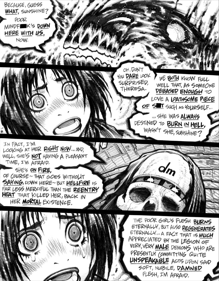
Not sure that this obscure lettering point is at all clear in this page, but the font used for the Infernal Service Provider’s dialogue is supposed to be conventionally consistent and straightforward, whereas the font used for Deathmonger’s dialogue is lettered with constantly varying sizes, in an attempt to convey the unevenness and wavering quality of this villain’s particular form of Superdead speech.
TBH, this stunt wound up looking more like crappy lettering on my part than a perceptible a creative riff. Oh, well. Italics might’ve been a better way to go, but the truth is that I can’t hand-letter in italics at all consistently.
Today’s Patreon update: As it’s a Wednesday, time for the $5+ Patron tiers to get their weekly dose of commissioned damsel-in-distress content!
-Adam Warren

