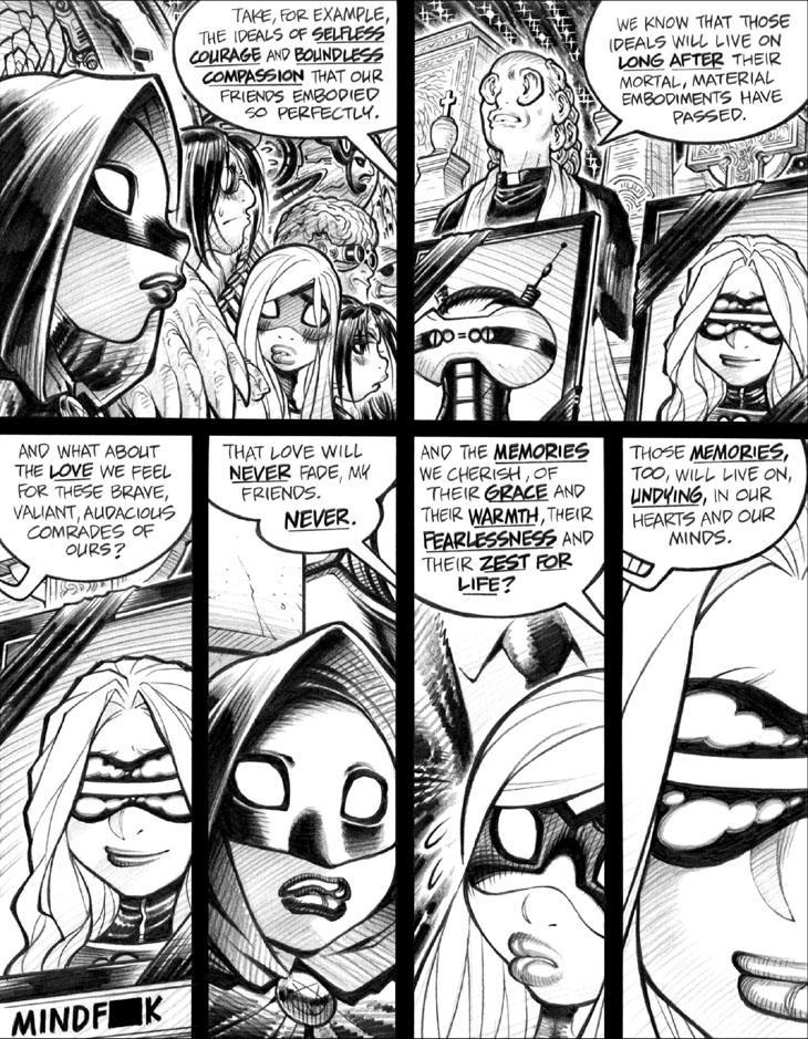
Panel 1: I was quite deliberately lettering smaller than usual throughout most of this volume, in part as an (arguably misguided) attempt to deal with the issue of Overdialoguing. (Better, of course, not to Overdialogue in the first place, but let’s ignore that.) Also, though, I was noticing that my hand-lettered fonts were just a bit too large, making the lettering take up more space than necessary; I often bitch and moan about excessively wee and teeny font sizes in modern comics lettering, but too large a font can be an issue as well, however are that might be. That’s even more true nowadays, gotta admit, as softer-leaded pencils and deteriorating eyesight have made my lettering ever larger and sloppier over time. I simply can’t produce text as small, precise, and well-spaced (between lines) as this page’s examples any more.
Panel 2: The “ear-eyed priest” is a hyper-obscure reference to a cover painting from an old issue of the SF(-adjacent) magazine Omni that clearly made a big impression on Young Me.
-Adam Warren

