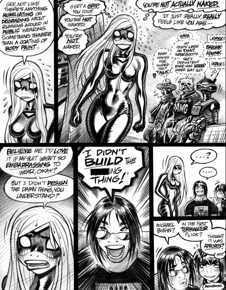
One point that strikes me immediately when I look over these Empowered vol. 1 pages: Holy crap, was I ever laissez-faire about my lettering back in the bygone, halcyon days of 2005-6. Harkening back to the series’ ignominious origin as a handful of throwaway “joke pages,” I wasn’t exactly knocking myself out with an exacting and exhaustive approach to the lettering in these early installments. Then again, Empowered as a whole was a deliberately imperfect and freewheeling alternative to the painstaking—and painfully slow—perfectionism that had made much of my earlier creative process into a protracted and tedious grind. Thus, not a very big surprise that the stories’ lettering was just as casual and tossed-off as the rest of the series.
In my meager defense, by the way, my hand-lettered “body copy” had never seen print before. I’d lettered plenty of background signs and logos, but my inked production of fonts and word balloons was so direly flawed that I’d never formally lettered much dialogue in my published work. Then again, that would’ve been rather pointless, given that I worked with phenomenally skilled professional letterers on Dirty Pair and Gen13, such as Tom Orzechowski, Tomoko Saito, L. Lois Buhalis, Bill Oakley and more, all of whom were dramatically better at the job than I ever was. I often hand-lettered my own roughs and layout pages, but that was “for position only” text, never meant to be seen in a finished comic. (Save, perhaps, for the “deconstructionism run amuck” sequence at the end of Gen13: Magical Drama Queen Roxy, which degenerated from finished color art to pencils to roughs to script as the narrative devolved. Any similarities to the notorious ep.25-26 of Neon Genesis Evangelion are, of course, strictly coincidental.)
When I began cranking out the pages that morphed and mutated into Empowered proper, bringing in a professional letterer was out of the question. I simply didn’t want to deal with the hassle and expense of calling in a pro, as I wouldn’t wind up making any real money off the series until years and years after publication. (Plus, let’s face it, “real lettering” would’ve looked weirdly out of place on these loose and sketchy pages.) So, for Empowered I just rolled with a marginally cleaner version of the messy and uneven hand lettering that I’d always scribbled on my layout pages.
For the record, the reason why my emphasis lettering on these pages is bolded and underlined—as opposed to the more standard comics practice of bolded and italicized fonts—is that I can’t consistently hand-letter in italics. Note that, goofily enough, much of the lettering scrawled on this page is already a bit slanty; the problem is, I can’t quite maintain a consistent enough degree of slantiness to properly represent italicization. Plus, bolded and underlined emphasis lettering was already a familiar concept for me, as that’s the format used in a comics script to clearly indicate to the letterer which words should be emphasized.
Yikes! Just realized that I’ve spent most of today’s Treadmill Time churning out entirely too much lettering-related blather for a single day’s commentary. Well, that’s enough word-balloon buffoonery for today; worry not, I’ll undoubtedly return to the topic—a personal obsession, admittedly—in future commentaries.
-Adam Warren

